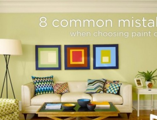
Today’s Colour Trends and Why I don’t alway follow them.
Shopping is overwhelming enough, isn’t it? So why not just follow the trends and you are done, right? Wait a minute, what if you wasted all your money on something that’s going to look dated or is already dated??
How do you know what to choose?
Me as a seasoned professional? I never follow the trends right out of the gate, in fact I purposely try not to follow the trends. All my clients know I always start with a question : “How do you want the room to feel?” or “What do you want it to say to your guests?”
Then I dissect that answer and interpret it visually with all my design principles, and tools. The answer to this question Will be the look and feel of the room. The room will be warm, clean,modern — what ever you want it to be.
I want to make it clear that choosing the latest colours is NOT the first step to designing a space. But being Current is Very important. As a Designer I can help clients to sort through all the options so that the property stays current as long as possible and has good QUALITY bones, and that it WORKS with your existing furnishings. That way – adding a trendy piece or colour is easy!
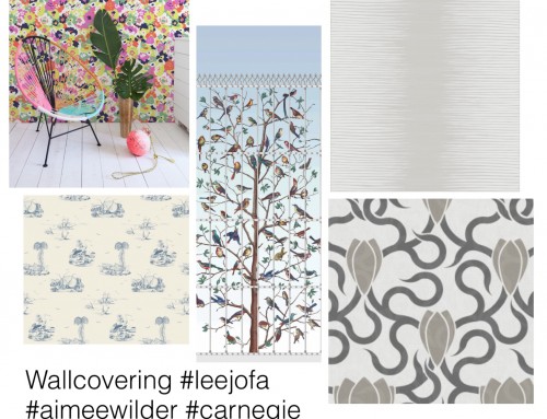
If you are ready for change – take a look at these:
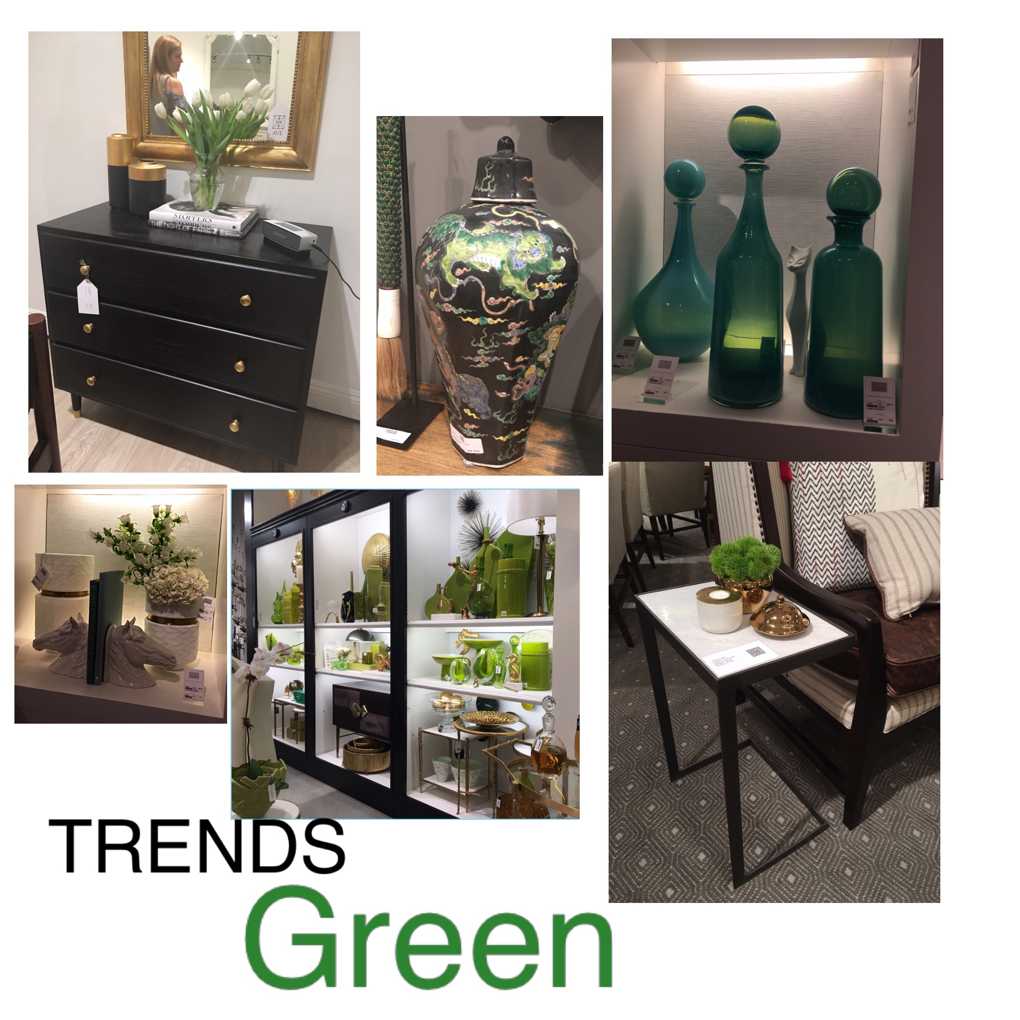
You can see here three of the top colour trends at the Las Vegas Furniture Market.

Green and Black
This Green trend partners up with Black well and can really brighten up a gray room. Here you can see it used in accessories with black and white furniture to create a richness and freshness.
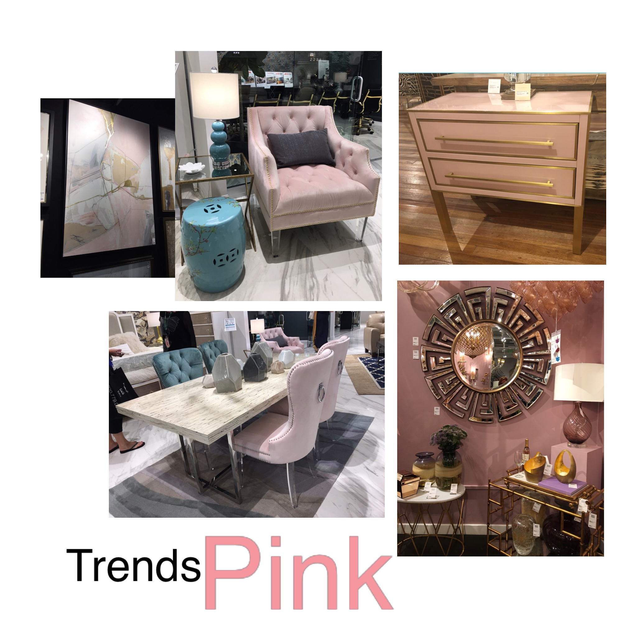
Pink Trend Colour 2017/2018 Curated from #Cyan Design, #Hadley Drive, #Abbyson Interiors, #Eastbank Art by Shelley Scales Design
Trends can inspire you to make quick and easy changes and help your home look like you are in-the-now. For example, a splash of the right pink shown here, on sofa or a wall can be just the change that will transform the room and modernize it.
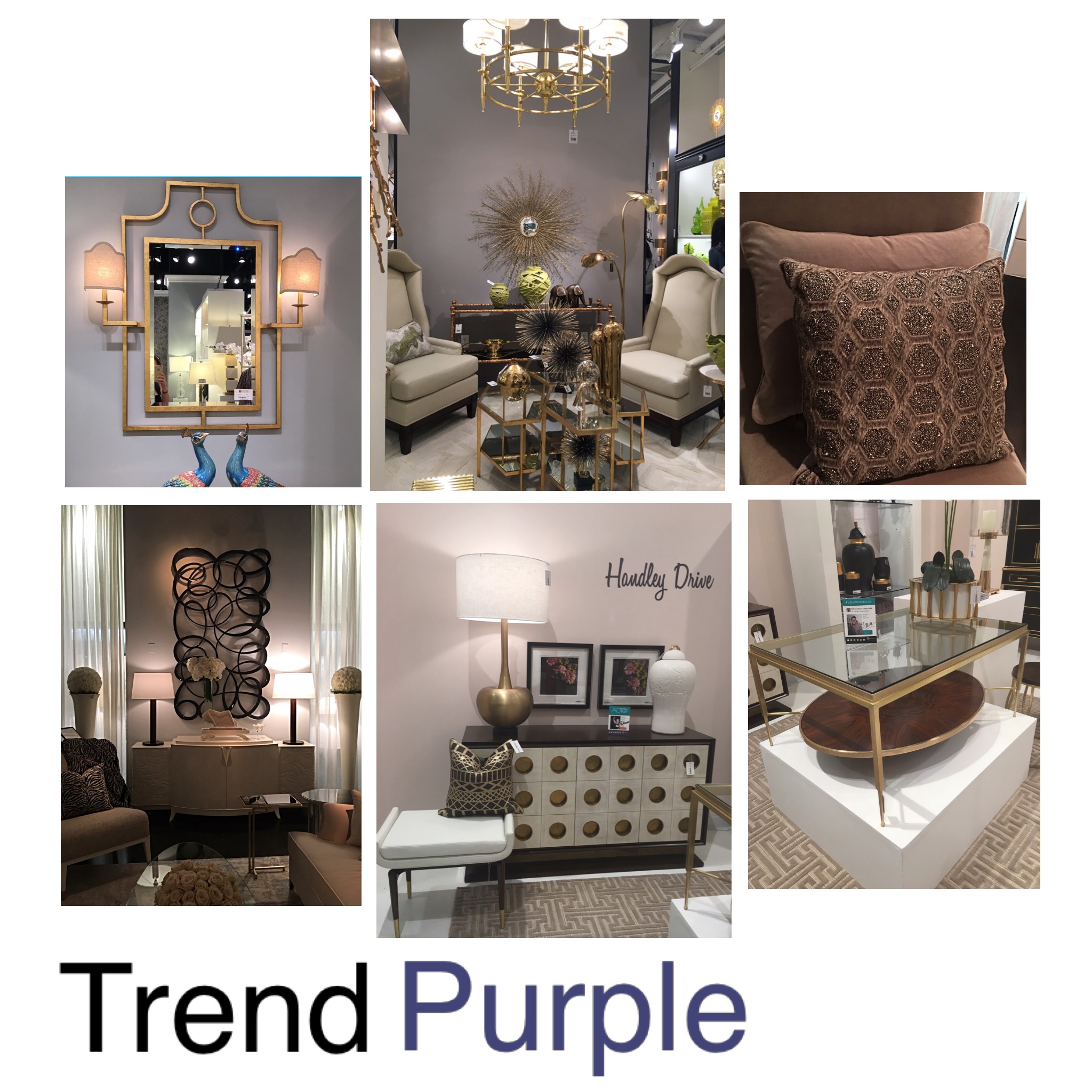
Purple Colour Trend 2017/2018 Curated from #Christopher Guy, #Port 68, #Global Imports, By Shelley Scales Design
An interesting thing about trends are that they are a reflection of the economy, buying habits and mood of the consumer . For instance a surprising trend is the movement toward Purples – some consumers are feeling a bit “blue”, so purple from amethyst to lilac is gaining in popularity.
Plums, brown, silver and pops of gold curated by Shelley Scales Design
Leave A Comment